> ## Documentation Index
> Fetch the complete documentation index at: https://cometchat-22654f5b-docs-platform-agentic.mintlify.site/llms.txt
> Use this file to discover all available pages before exploring further.
# Search
## Overview
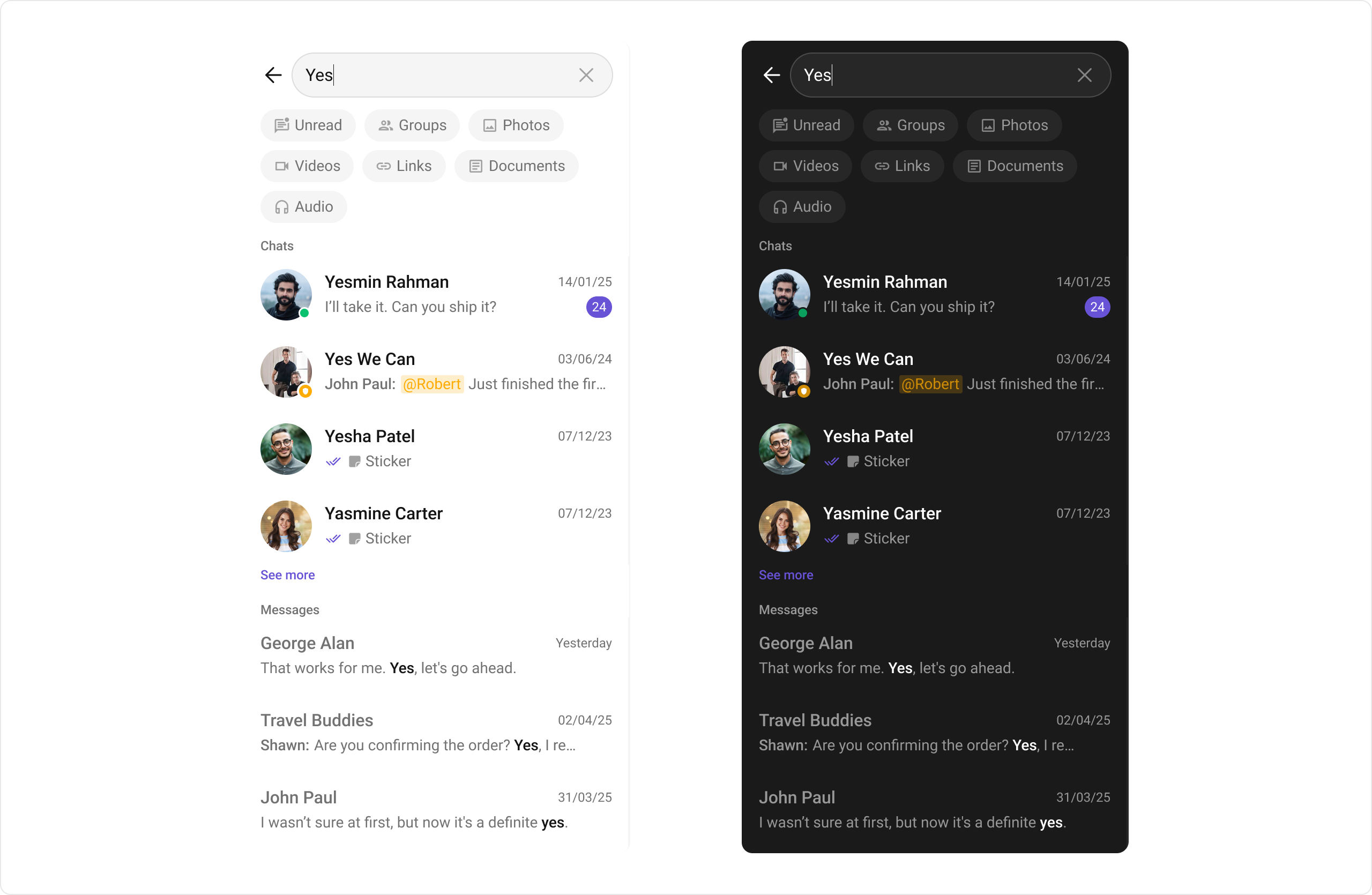
The `CometChatSearch` component is a powerful and customizable search interface that allows users to search across conversations and messages in real time. It supports a wide variety of filters, scopes, and customization options. `CometChatSearch` helps users find messages, conversations, media, and more through an intuitive and filterable search experience. It can be embedded in multiple contexts — as part of the conversation list, message header, or as a full-screen search experience.
 ## Usage
### Integration
You can launch `CometChatSearch` directly using `Navigator.push`, or you can define it as a widget within the `build` method of your `State` class.
##### 1. Using Navigator to Launch `CometChatSearch`
```dart theme={null}
Navigator.push(context, MaterialPageRoute(builder: (context) => CometChatSearch()));
```
##### 2. Embedding `CometChatSearch` as a Widget in the build Method
```dart theme={null}
import 'package:cometchat_chat_uikit/cometchat_chat_uikit.dart';
import 'package:flutter/material.dart';
class SearchComponent extends StatefulWidget {
const SearchComponent({super.key});
@override
State createState() => _SearchComponentState();
}
class _SearchComponentState extends State {
@override
Widget build(BuildContext context) {
return Scaffold(
body: SafeArea(
child: CometChatSearch(),
)
);
}
}
```
***
### Actions
[Actions](/ui-kit/flutter/components-overview#actions) dictate how a widget functions. They are divided into two types: Predefined and User-defined. You can override either type, allowing you to tailor the behavior of the widget to fit your specific needs.
#### 1. onConversationClicked
`onConversationClicked` is triggered when you click on a Conversation from the search result. The `onConversationClicked` action doesn’t have a predefined behavior. You can override this action using the following code snippet.
```dart theme={null}
CometChatSearch(
onConversationClicked: (conversation) {
// Handle conversation click
},
);
```
***
#### 2. onMessageClicked
`onMessageClicked` is triggered when you click on a Message from the search result. The `onMessageClicked` action doesn’t have a predefined behavior. You can override this action using the following code snippet.
```dart theme={null}
CometChatSearch(
onMessageClicked: (message) {
// Handle message click
},
);
```
***
#### 3. onBack
`OnBack` is triggered when you click on the back button of the Message Header component. You can override this action using the following code snippet.
```dart theme={null}
CometChatSearch(
onBack: () {
// Handle back action
},
);
```
***
#### 4. onError
This action doesn’t change the behavior of the component but rather listens for any errors that occur in the Conversations component.
```dart theme={null}
CometChatSearch(
onError: (e) {
// Handle error
},
);
```
***
### Filters
#### 1. ConversationsRequestBuilder
You can set the `ConversationsRequestBuilder` in the Search Component to filter the search result. You can modify the builder as per your specific requirements with multiple options available to know more refer to `ConversationRequestBuilder`.
```dart theme={null}
CometChatSearch(
conversationsRequestBuilder: ConversationsRequestBuilder(),
);
```
***
#### 2. MessagesRequestBuilder
You can set the `MessagesRequestBuilder` in the Search Component to filter the search result. You can modify the builder as per your specific requirements with multiple options available to know more refer to `MessagesRequestBuilder`.
```dart theme={null}
CometChatSearch(
messagesRequestBuilder: MessagesRequestBuilder(),
);
```
***
## Events
`Events` are emitted by a Component. By using event you can extend existing functionality. Being global events, they can be applied in multiple locations and are capable of being added or removed.
The `CometChatSearch` component does not produce any events.
***
## Customization
To fit your app’s design requirements, you can customize the appearance of the `CometChatSearch` component. We provide exposed methods that allow you to modify the experience and behavior according to your specific needs.
## Style
Using Style you can customize the look and feel of the component in your app, These parameters typically control elements such as the color, size, shape, and fonts used within the component.
## Usage
### Integration
You can launch `CometChatSearch` directly using `Navigator.push`, or you can define it as a widget within the `build` method of your `State` class.
##### 1. Using Navigator to Launch `CometChatSearch`
```dart theme={null}
Navigator.push(context, MaterialPageRoute(builder: (context) => CometChatSearch()));
```
##### 2. Embedding `CometChatSearch` as a Widget in the build Method
```dart theme={null}
import 'package:cometchat_chat_uikit/cometchat_chat_uikit.dart';
import 'package:flutter/material.dart';
class SearchComponent extends StatefulWidget {
const SearchComponent({super.key});
@override
State createState() => _SearchComponentState();
}
class _SearchComponentState extends State {
@override
Widget build(BuildContext context) {
return Scaffold(
body: SafeArea(
child: CometChatSearch(),
)
);
}
}
```
***
### Actions
[Actions](/ui-kit/flutter/components-overview#actions) dictate how a widget functions. They are divided into two types: Predefined and User-defined. You can override either type, allowing you to tailor the behavior of the widget to fit your specific needs.
#### 1. onConversationClicked
`onConversationClicked` is triggered when you click on a Conversation from the search result. The `onConversationClicked` action doesn’t have a predefined behavior. You can override this action using the following code snippet.
```dart theme={null}
CometChatSearch(
onConversationClicked: (conversation) {
// Handle conversation click
},
);
```
***
#### 2. onMessageClicked
`onMessageClicked` is triggered when you click on a Message from the search result. The `onMessageClicked` action doesn’t have a predefined behavior. You can override this action using the following code snippet.
```dart theme={null}
CometChatSearch(
onMessageClicked: (message) {
// Handle message click
},
);
```
***
#### 3. onBack
`OnBack` is triggered when you click on the back button of the Message Header component. You can override this action using the following code snippet.
```dart theme={null}
CometChatSearch(
onBack: () {
// Handle back action
},
);
```
***
#### 4. onError
This action doesn’t change the behavior of the component but rather listens for any errors that occur in the Conversations component.
```dart theme={null}
CometChatSearch(
onError: (e) {
// Handle error
},
);
```
***
### Filters
#### 1. ConversationsRequestBuilder
You can set the `ConversationsRequestBuilder` in the Search Component to filter the search result. You can modify the builder as per your specific requirements with multiple options available to know more refer to `ConversationRequestBuilder`.
```dart theme={null}
CometChatSearch(
conversationsRequestBuilder: ConversationsRequestBuilder(),
);
```
***
#### 2. MessagesRequestBuilder
You can set the `MessagesRequestBuilder` in the Search Component to filter the search result. You can modify the builder as per your specific requirements with multiple options available to know more refer to `MessagesRequestBuilder`.
```dart theme={null}
CometChatSearch(
messagesRequestBuilder: MessagesRequestBuilder(),
);
```
***
## Events
`Events` are emitted by a Component. By using event you can extend existing functionality. Being global events, they can be applied in multiple locations and are capable of being added or removed.
The `CometChatSearch` component does not produce any events.
***
## Customization
To fit your app’s design requirements, you can customize the appearance of the `CometChatSearch` component. We provide exposed methods that allow you to modify the experience and behavior according to your specific needs.
## Style
Using Style you can customize the look and feel of the component in your app, These parameters typically control elements such as the color, size, shape, and fonts used within the component.
 ```dart theme={null}
CometChatSearch(
searchStyle: CometChatSearchStyle(
backgroundColor: const Color(0xFFEDEAFA),
searchFilterChipTextStyle: const TextStyle(fontFamily: 'TimesNewRoman'),
searchSectionHeaderTextStyle: const TextStyle(fontFamily: 'TimesNewRoman'),
searchConversationItemBackgroundColor: const Color(0xFFEDEAFA),
searchConversationSubTitleTextStyle: const TextStyle(fontFamily: 'TimesNewRoman'),
searchConversationTitleTextStyle: const TextStyle(fontFamily: 'TimesNewRoman'),
searchConversationDateTextStyle: const TextStyle(
fontFamily: 'TimesNewRoman',
fontWeight: FontWeight.bold,
),
searchSeeMoreStyle: const TextStyle(fontFamily: 'TimesNewRoman'),
searchMessageItemBackgroundColor: const Color(0xFFEDEAFA),
searchMessageTitleTextStyle: const TextStyle(fontFamily: 'TimesNewRoman'),
searchMessageSubTitleTextStyle: const TextStyle(fontFamily: 'TimesNewRoman'),
searchMessageTimeStampStyle: CometChatDateStyle(
textStyle: const TextStyle(fontFamily: 'TimesNewRoman'),
),
searchTextStyle: const TextStyle(fontFamily: 'TimesNewRoman'),
),
);
```
***
### Functionality
These are a set of small functional customizations that allow you to fine-tune the overall experience of the component. With these, you can toggle the visibility of UI elements.
Below is a list of customizations along with corresponding code snippets
## CometChatMessageHeader Properties
Following is a list of customizations along with their corresponding code snippets:
| Property | Data Type | Description |
| ----------------------- | ---------------- | ------------------------------------------------------------------ |
| `user` | `User?` | Set `User` object, one is mandatory either `user` or `group`. |
| `group` | `Group?` | Set `Group` object, one is mandatory either `user` or `group`. |
| `usersStatusVisibility` | `bool?` | Controls visibility of status indicator shown if a user is online. |
| `groupTypeVisibility` | `bool?` | Hide the group type icon which is visible on the group icon. |
| `initialStateView` | `WidgetBuilder?` | Sets view fow initial state |
| `loadingStateView` | `WidgetBuilder?` | Sets view fow loading state |
| `emptyStateView` | `WidgetBuilder?` | Sets view fow empty state |
| `errorStateView` | `WidgetBuilder?` | Sets view fow error state |
***
### Advanced
For advanced-level customization, you can set custom views to the component. This lets you tailor each aspect of the component to fit your exact needs and application aesthetics. You can create and define your views, layouts, and UI elements and then incorporate those into the component.
***
#### conversationItemView
With this function, you can assign a custom list item view to an conversation in the search result. For more information, refer to the [listItemView](/ui-kit/flutter/conversations#listitemview) prop of the `CometChatConversations` component.
#### conversationLeadingView
With this function, you can assign a custom leading view to an conversation in the search result. For more information, refer to the [leadingView](/ui-kit/flutter/conversations#leadingview) prop of the `CometChatConversations` component.
#### conversationTitleView
With this function, you can assign a custom title view of an conversation in the search result. For more information, refer to the [titleview](/ui-kit/flutter/conversations#titleview) prop of the `CometChatConversations` component.
#### conversationSubtitleView
With this function, you can assign a custom subtitle view to an conversation in the search result. For more information, refer to the [subtitleview](/ui-kit/flutter/conversations#subtitleview) prop of the `CometChatConversations` component.
#### conversationTailView
With this function, you can assign a custom tail view to an conversation in the search result. For more information, refer to the [trailingview](/ui-kit/flutter/conversations#trailingview) prop of the `CometChatConversations` component.
#### MessageItemView
With message item view functions, you can assign custom views to different types of messages in the search result.
Here’s how you can override the default message item view with a custom one for text messages:
```dart theme={null}
CometChatSearch(
searchTextMessageView: (context, message) {
String senderName = message.sender?.name ?? "Unknown";
String messageText = "";
messageText = message.text;
return Container(
padding: const EdgeInsets.all(16),
width: double.infinity,
color: const Color(0xFFE8E4F3),
child: Row(
children: [
Text(
"$senderName: ",
style: const TextStyle(
color: Color(0xFF6B4FBB),
fontSize: 16,
fontWeight: FontWeight.bold,
),
),
Expanded(
child: Text(
messageText,
maxLines: 1,
overflow: TextOverflow.ellipsis,
style: const TextStyle(
color: Color(0xFF4A4A4A),
fontSize: 16,
),
),
),
],
),
);
},
);
```
```dart theme={null}
CometChatSearch(
searchStyle: CometChatSearchStyle(
backgroundColor: const Color(0xFFEDEAFA),
searchFilterChipTextStyle: const TextStyle(fontFamily: 'TimesNewRoman'),
searchSectionHeaderTextStyle: const TextStyle(fontFamily: 'TimesNewRoman'),
searchConversationItemBackgroundColor: const Color(0xFFEDEAFA),
searchConversationSubTitleTextStyle: const TextStyle(fontFamily: 'TimesNewRoman'),
searchConversationTitleTextStyle: const TextStyle(fontFamily: 'TimesNewRoman'),
searchConversationDateTextStyle: const TextStyle(
fontFamily: 'TimesNewRoman',
fontWeight: FontWeight.bold,
),
searchSeeMoreStyle: const TextStyle(fontFamily: 'TimesNewRoman'),
searchMessageItemBackgroundColor: const Color(0xFFEDEAFA),
searchMessageTitleTextStyle: const TextStyle(fontFamily: 'TimesNewRoman'),
searchMessageSubTitleTextStyle: const TextStyle(fontFamily: 'TimesNewRoman'),
searchMessageTimeStampStyle: CometChatDateStyle(
textStyle: const TextStyle(fontFamily: 'TimesNewRoman'),
),
searchTextStyle: const TextStyle(fontFamily: 'TimesNewRoman'),
),
);
```
***
### Functionality
These are a set of small functional customizations that allow you to fine-tune the overall experience of the component. With these, you can toggle the visibility of UI elements.
Below is a list of customizations along with corresponding code snippets
## CometChatMessageHeader Properties
Following is a list of customizations along with their corresponding code snippets:
| Property | Data Type | Description |
| ----------------------- | ---------------- | ------------------------------------------------------------------ |
| `user` | `User?` | Set `User` object, one is mandatory either `user` or `group`. |
| `group` | `Group?` | Set `Group` object, one is mandatory either `user` or `group`. |
| `usersStatusVisibility` | `bool?` | Controls visibility of status indicator shown if a user is online. |
| `groupTypeVisibility` | `bool?` | Hide the group type icon which is visible on the group icon. |
| `initialStateView` | `WidgetBuilder?` | Sets view fow initial state |
| `loadingStateView` | `WidgetBuilder?` | Sets view fow loading state |
| `emptyStateView` | `WidgetBuilder?` | Sets view fow empty state |
| `errorStateView` | `WidgetBuilder?` | Sets view fow error state |
***
### Advanced
For advanced-level customization, you can set custom views to the component. This lets you tailor each aspect of the component to fit your exact needs and application aesthetics. You can create and define your views, layouts, and UI elements and then incorporate those into the component.
***
#### conversationItemView
With this function, you can assign a custom list item view to an conversation in the search result. For more information, refer to the [listItemView](/ui-kit/flutter/conversations#listitemview) prop of the `CometChatConversations` component.
#### conversationLeadingView
With this function, you can assign a custom leading view to an conversation in the search result. For more information, refer to the [leadingView](/ui-kit/flutter/conversations#leadingview) prop of the `CometChatConversations` component.
#### conversationTitleView
With this function, you can assign a custom title view of an conversation in the search result. For more information, refer to the [titleview](/ui-kit/flutter/conversations#titleview) prop of the `CometChatConversations` component.
#### conversationSubtitleView
With this function, you can assign a custom subtitle view to an conversation in the search result. For more information, refer to the [subtitleview](/ui-kit/flutter/conversations#subtitleview) prop of the `CometChatConversations` component.
#### conversationTailView
With this function, you can assign a custom tail view to an conversation in the search result. For more information, refer to the [trailingview](/ui-kit/flutter/conversations#trailingview) prop of the `CometChatConversations` component.
#### MessageItemView
With message item view functions, you can assign custom views to different types of messages in the search result.
Here’s how you can override the default message item view with a custom one for text messages:
```dart theme={null}
CometChatSearch(
searchTextMessageView: (context, message) {
String senderName = message.sender?.name ?? "Unknown";
String messageText = "";
messageText = message.text;
return Container(
padding: const EdgeInsets.all(16),
width: double.infinity,
color: const Color(0xFFE8E4F3),
child: Row(
children: [
Text(
"$senderName: ",
style: const TextStyle(
color: Color(0xFF6B4FBB),
fontSize: 16,
fontWeight: FontWeight.bold,
),
),
Expanded(
child: Text(
messageText,
maxLines: 1,
overflow: TextOverflow.ellipsis,
style: const TextStyle(
color: Color(0xFF4A4A4A),
fontSize: 16,
),
),
),
],
),
);
},
);
```
 Bellow is the list of message item view functions available for customization:
| Function | Message Type |
| ------------------------ | ---------------- |
| `searchTextMessageView` | Text Message |
| `searchImageMessageView` | Image Message |
| `searchAudioMessageView` | Audio Message |
| `searchFileMessageView` | Document Message |
| `searchMessageLinkView` | Link Message |
| `searchVideoMessageView` | Video Message |
#### DateTime Formatters
#### dateSeparatorFormatterCallback
You can modify the date pattern of the chat history date separator to your requirement using `dateSeparatorFormatterCallback`. This method accepts a function with a return type String. Inside the function, you can create your own pattern and return it as a String.
#### TextFormatters
Assigns the list of text formatters. If the provided list is not null, it sets the list. Otherwise, it assigns the default text formatters retrieved from the data source. To configure the existing Mentions look and feel check out [MentionsFormatter Guide](/ui-kit/flutter/mentions-formatter-guide)
***
Bellow is the list of message item view functions available for customization:
| Function | Message Type |
| ------------------------ | ---------------- |
| `searchTextMessageView` | Text Message |
| `searchImageMessageView` | Image Message |
| `searchAudioMessageView` | Audio Message |
| `searchFileMessageView` | Document Message |
| `searchMessageLinkView` | Link Message |
| `searchVideoMessageView` | Video Message |
#### DateTime Formatters
#### dateSeparatorFormatterCallback
You can modify the date pattern of the chat history date separator to your requirement using `dateSeparatorFormatterCallback`. This method accepts a function with a return type String. Inside the function, you can create your own pattern and return it as a String.
#### TextFormatters
Assigns the list of text formatters. If the provided list is not null, it sets the list. Otherwise, it assigns the default text formatters retrieved from the data source. To configure the existing Mentions look and feel check out [MentionsFormatter Guide](/ui-kit/flutter/mentions-formatter-guide)
***